

“Just email the file. It’ll be fine.”
Those are the famous last words of a marketing budget. In the world of high-stakes print, that sentence is the equivalent of saying “I’ll perform my own root canal.” It sounds cost-effective until the blood starts hitting the floor.
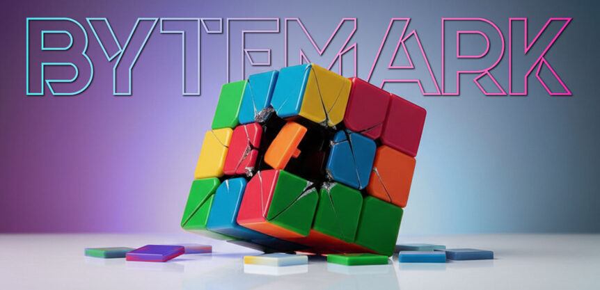
Print isn’t plug-and-play. You can’t just sacrifice six hours of your life to a “free” design app, drag a file into someones inbox, and pray it emerges as a flawless branding pack. Hope is not a production strategy—it’s a recipe for expensive bog roll!.
At BYTEMARK Creative, we perform a full forensic autopsy on your artwork before it hits the press. Here’s why we educate you on the “DIY disasters” before they become your nightmare:
1. The Color Cemetery (RGB vs. CMYK)
Your screen uses light, what we call transmitted light to show you vibrant oranges and electric greens and it all looks levely on your phone but printers use CMYK (and sometimes Pantone) ink and this is what we call reflective. If your artwork stays in RGB, those neon dreams will turn into a muddy, greyish-brown nightmare on paper. With the added issue of the printers CMYK profiles spanner, we know you are already struggling.
2. The Bleed-Out
That 3mm bleed that the printer asks for isn’t “optional decoration.” It’s the difference between a professional edge or a white border that screams “I did this in my lunch break.” Without it, the guillotine will ruin your layout, and your pride. Make sure your art survives the blade.
3. Layers of Hell (Tricky Finishes)
Dreaming of Spot UV, Foil, or Embossing? These require specialised and perfectly registered layers. Most free apps treat your design like a flat pancake. If you send a flat file for that luxury finish, the production line will literally bounce it right back at you. We build the architecture that makes your finishes actually… finish.
4. Digital Ghosting (Low Resolution)
Our persoanl favourite. That logo looked great on your 6-inch phone screen. On a 2-meter banner or a pullup? It looks like a Minecraft character having a stroke. If it’s 72dpi, it’s going to look like a grainy fax from last century. We make sure your imagery is fit for the real world, not just the thumbnail world with print ready vector files and set at the correct size for both web or print.
5. Font Gore
Unflattened layers and missing fonts are the ghosts that haunt printing presses. If the printer’s computer doesn’t have your free / specific font, it’ll replace it with something hideous like Comic Sans and there is nothing funny about that!. We make sure we embed everything correctly so there are no jump-scares on delivery day.
The Bitter Truth
The “hours saved” by doing it yourself are quickly eaten up by the weeks of regret when the delivery pallet arrives full of expensive bin food. You aren’t just losing money; you’re losing your sanity. Stop playing “Graphic Designer” with apps meant for making birthday cards and let BYTEMARK Creative handle the heavy lifting.
BYTEMARK Creative: We make the files, we save the print, and we keep your brand out of the printers graveyard.
Stop the Horror. Start the Print.
Don’t let your next project become a cautionary tale. Choose your path below:
1: Already have a file that’s giving you the cold sweats? Send it to our forensic team for a professional audit before you hit “print.”
2: Skip the free apps and the 3:00 AM headaches. Let BYTEMARK design it from scratch so it works perfectly the first time.
3: Not sure if your colours will survive the transition to ink? Book a call and chat about the reality before you commit to the run.
Stop guessing. Start impressing.